Surface weather analysis charts are a treasure trove of information about regional and continent-scale weather patterns. They are full of a variety of symbols that can give a good at-a-glance view of what conditions are occuring. Some regional and continental forecasts are also displayed as analysis charts.
There are multiple organizations that create surface weather analysis maps. A few of these are generated by computers based on model data, but in most cases an analysis you see was created (or at least reviewed) by a human meteorologist. There are small differences between what different organizations show on their analysis charts. This article reviews data that can be found on NOAA maps sourced from the Ocean Prediction Center (see above) and the Weather Prediction Center (see below), but generally speaking can be applied to other maps such as those created by Environment Canada and the UK Met Office.

NOAA maps are generated every three hours by the Weather Prediction Center for North America and every six hours for the Northern Hemisphere by the Ocean Prediction Center. The two centers collaborate with each other, the National Hurricane Center, and the National Weather Service office in Honolulu. Other organizations will have their own timelines.
Most surface analysis charts will use millibars for air pressure and knots for wind. American maps will feature surface temperatures in °F while others will be in °C. All air pressures displayed are sea level pressures. Pressure drops with altitude but to track and forecast weather systems, meteorologists use a mathematical formula to calculate what the pressure would be if that location were at sea level.
If the calculation wasn’t done, surface maps would always show extremely low pressure in mountain areas like Yellowstone which would not be very useful for forecasting or describing weather events. When I wrote this paragraph the air pressure at Yellowstone Lake was 760.8 mb – far below the record strongest tropical cyclone observed (870 mb in Typhoon Tip). The calculated sea level pressure at that station was 1018.0 mb which reflects modestly high pressure compared to the global average of 1013.25 mb.
It is important to note that surface weather analysis charts describe conditions generally. Small features that can’t be reasonably displayed on a regional map may be omitted. This is most notable in mountain regions with a lot of terrain.
High and low pressure centers

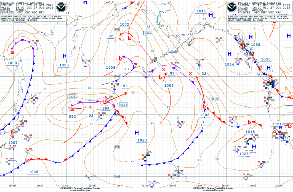
Perhaps the most obvious feature on surface analysis maps are all the lines, but for understanding what’s going on I think it’s important to start with high and low pressure centers. These are marked simply with an L (for low pressure, usually red) and an H (for high pressure, usually blue). Nearby you will likely find a number displaying the lowest or highest air pressure in millibars for that pressure center. Some maps will have arrows depicting the system’s forecast movement.
In the example above, the low has a minimum central pressure of 1006 mb while the high has a maximum central pressure of 1041 mb. Some maps will also note how strong the winds are around a low pressure system as lows often (but not always) produce stormy conditions. In this case, the low has gale-force winds defined as being between 34 and 47 knots (63 to 87 km/h). Other lables are storm (48 to 63 knots, 88 to 117 km/h) and hurricane force (at or greater than 64 knots, 118 km/h). Wind speeds represent sustained winds, gusts will be higher.
Surrounding high and low pressure centers are thin lines, often circular near the systems themselves, called isobars that connect equal areas of pressure. Like on a topographic map where everywhere along the 1000 foot contour is 1000 feet above sea level, everywhere along the 1016 mb contour has a sea level pressure of 1016 mb. Tighter lines represent strong pressure gradients that produce strong winds whereas when they are further apart one could expect lighter winds.
Fronts and other lines

Low pressure systems in the mid and upper latitudes (about 30°N or S of the equator) will often have fronts that define the boundaries between warm and cold sectors of the storm. In many cases a passing front can bring a substantial change in weather conditions at that location, but other times the boundary is more subtle.
Cold fronts are marked in blue with triangles pointing the direction the front is moving. Warm fronts are red with half-circles on the side representing the direction it is moving. When a cold front passes over, the location passes from the warm sector to the cold sector of the system whereas when a warm front passes over the location shifts into the warm sector. As a cyclone matures, the cold front will catch up with the warm front to become an occluded front marked in purple with markings pointing the direction the front is moving.
Sometimes a front will stop moving and become a stationary front for a while. This is marked as alternating red and blue using the symbols of both cold and warm fronts. When a front is dotted it can either be forming (frontogenesis, more frequent symbols) or dissipating (frontolysis, less frequent symbols.
Ridges and troughs are elongated areas of high and low pressure respectively, but rather than being a boundary, wind will flow around it as if it’s a pressure center. Squall lines have sudden wind increases followed by decreases and are often associated with thunderstorms or heavy snow.
Not shown in the legend above are dry lines, which are kind of like a front but instead of separating different temperature regions they separate moist from dry air. When a dry line moves into the moist region, it will often produce severe thunderstorms. Dry lines are marked with brown, orange, or yellow dependng on the map and have half circles pointing toward the moist side of the boundary.
Weather stations

Individual weather stations can be represented on surface weather maps with a wide variety of data displayed. A thorough description can be found from the Weather Prediction Center at this link but this article will only touch on features that are commonly noted on NOAA charts.
For stations that report cloud cover the light blue circle in the center of the plot will range between completely full (overcast skies) to being just an outline (clear skies). In the example the sky is overcast. A light blue line called a wind barb extends to the northwest indicating that the wind is coming from that direction.
Two perpendicular lines coming off the end of the wind barb show a wind speed of 20 knots. Wind speed can be represented by a mixture of small flags (50 kt), lines (10 kt), and half-length lines (5 kt). To determine the wind speed the user adds all these symbols up.
The example for this section shows a temperature of 24°F (red, top left), dew point of 23°F (green, bottom left), snow (pink symbol, left center), sea level pressure of 1021.8 mb (orange, right of the temperature), and that the pressure was rising earlier but is now falling and has dropped 1 mb in the last three hours (gold symbol and number, right center).
Air pressure values omit the leading 10 or 9 so that 982 on the map would be 998.2 mb, 065 would be 1006.5 mb, and so on.
Numerous symbols are used to display different types of weather. Little stars like in the example represent snow, dots for rain, lines for fog, an infinity symbol for haze, etc. More symbols represent stronger weather (like heavier rain). A full list of symbols used can be found at this link.
Tropical and polar features

Tropical cyclones including hurricanes are a type of low pressure system and are marked using the standard tropical storm and hurricane symbols. Additionally, will usually have a box with the name and maximum wind the storm is producing. These maps do not show the forecast path for the storm. Because the isobars around a tropical cyclone can become too tight to reasonably display on a regional map they can be omitted near the center.
Maps including the tropics may have the intertropical convergence zone (ITCZ) marked with two parallel red lines connected with short red lines in between. In the northern hemisphere tropics, the wind north of the ITCZ is out of the northeast, whereas to the south of it is out of the southeast. Thunderstorms are common in the ITCZ because the converging air is forced upward to generate clouds and shower activity.
In the Arctic, maps may have a dotted blue line which depicts where the sea ice covers more than 10% of the ocean’s surface. Freezing spray from wind blowing cold water onto boats may also be noted.
Where to find maps
Several governments produce surface weather analysis maps for their regions. Here are a few:
- United States
- Ocean Prediction Center – North Pacific, North Atlantic, Alaska region
- Weather Prediction Center – North America
- Canada – North America and Arctic
- United Kingdom – Europe and North Atlantic
- Australia – Australia, Oceania, and Southeast Asia
- Chile (in Spanish) – Southern South America and Southeast Pacific
- Japan – East Asia and West Pacific


4 Comments
Thanks for sharing! This is a great review of the system for reporting weather conditions.
My feed did not download the graphic you referenced.
Thanks for the links.
Sorry to hear the images didn’t work for you but glad the links did!